学習期間5ヶ月、独立後4ヶ月で月収30万を突破した「なる(@naru000006)」です。
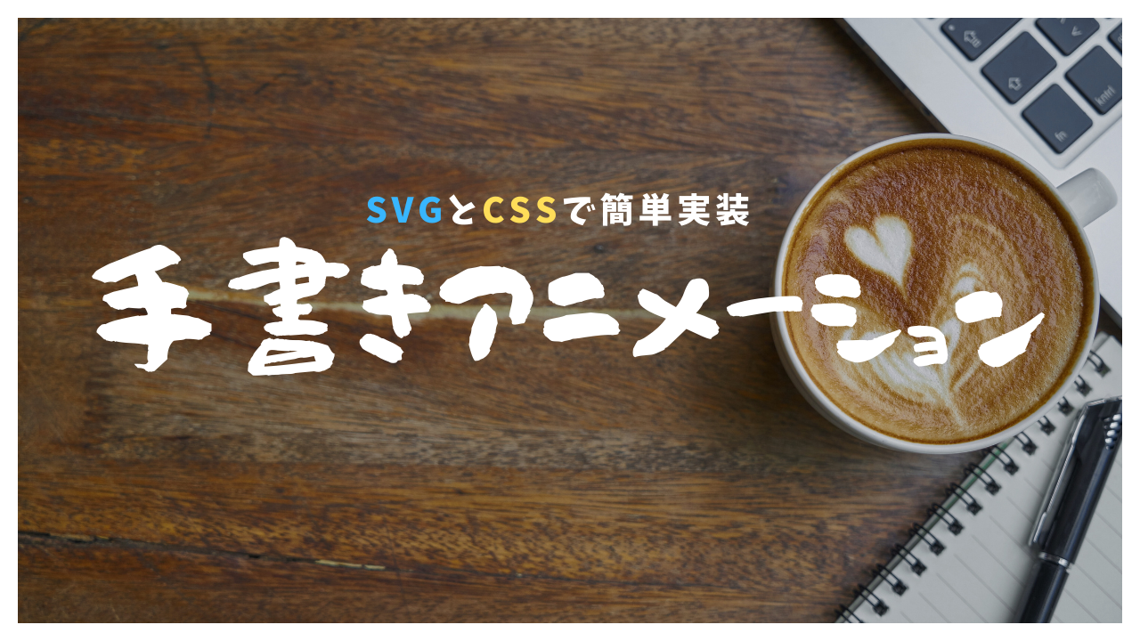
この記事では、手書きアニメーションをSVGとCSSで簡単に実装する方法を紹介しています。
実装すること
今回実装する手書きアニメーションはこちらです。
See the Pen 【手書きアニメーション】にこちゃん by narukichi06 (@narukichi06) on CodePen.
実装手順
- 画像をSVGで書き出す
- SVGを調整
- 書き出したSVGにクラスをつける
- キーフレームアニメーションを実装
①画像をSVGで書き出す
今回はイラレから画像をSVGで書き出します。
<?xml version="1.0" encoding="UTF-8"?>
<svg id="_レイヤー_1" data-name="レイヤー 1" xmlns="http://www.w3.org/2000/svg" viewBox="0 0 425.63 473.31">
  <path d="m157,439c-11.89-.96-76.88-7.19-101-52-31.45-58.41,29.37-140,81-177,5.02-3.59,112.98-78.34,209-18,48.22,30.3,86.24,90.14,78,144-12.52,81.88-133.29,158.84-293,131" style="fill: #fff; stroke: red; stroke-miterlimit: 10;"/>
  <path d="m172,250c-.67,12.67-1.33,25.33-2,38" style="fill: #fff; stroke: red; stroke-miterlimit: 10;"/>
  <path d="m325,253c-1.67,17.67-3.33,35.33-5,53" style="fill: #fff; stroke: red; stroke-miterlimit: 10;"/>
  <path d="m147,354c9.99,9.21,33.02,27.9,68,35,48.19,9.79,86.14-9.1,97-15" style="fill: #fff; stroke: red; stroke-miterlimit: 10;"/>
</svg>
初めてSVGファイルを見たときは「めっちゃ数字が並んどる…」と若干引きましたが、慣れます。
少し解説をすると、書き出したSVGには2種類のタグが存在します。
①SVGタグ
SVGタグで囲まれている中に、図形やテキストを描画する情報が入っています。
いわゆる、SVGの内部情報を入れる箱の役割がSVGタグです。
<svg width="100" height="100">
  <!-- ここに図形やテキストを描画 -->
</svg>
②pathタグ
pathタグで、曲線などの複雑な形状を定義しています。これがSVGの中身です。
三角形をSVGで書き出した例を出すと…
「M 10 10」 で始点を (10,10) に移動、「L 90 10」 で (90,10) まで線を引き、「L 50 90」 で (50,90) まで線を引き、Z でパスを閉じています。
これにより三角形が描かれます。
「fill=”green”」は図形の内部の色を緑で塗りつぶすという意味です。
<svg width="100" height="100">
  <path d="M 10 10 L 90 10 L 50 90 Z" fill="green"/>
</svg>
このように図形や文字を座標に置き換えることで、複雑な形状でも正確に表示することができるんですね。
SVGをHTMLに貼り付ける
話をもとに戻して、書き出したSVGをHTMLの必要な箇所に貼り付けて表示を確認しましょう。
このように表示されていればOKです。
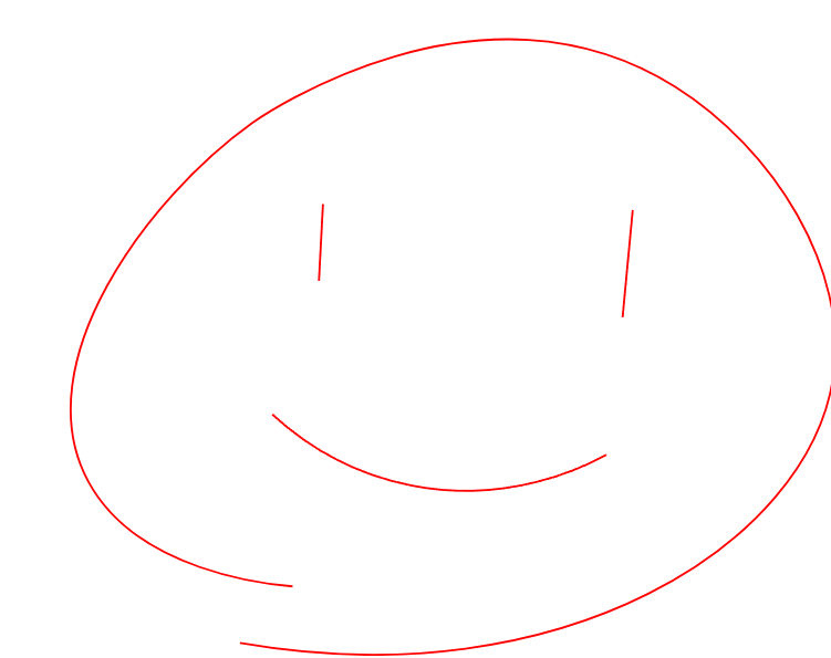
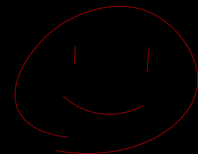
②SVGを調整
今回の場合、内部の白い箇所はいらないので、削除します。(わかりやすいようにbackground-colorを黒にしています)

「fill=”#fff”」を「fill=”transparent”」に変更してください。
<svg id="_レイヤー_1" data-name="レイヤー 1" xmlns="http://www.w3.org/2000/svg" viewBox="0 0 425.63 473.31">
<path d="m157,439c-11.89-.96-76.88-7.19-101-52-31.45-58.41,29.37-140,81-177,5.02-3.59,112.98-78.34,209-18,48.22,30.3,86.24,90.14,78,144-12.52,81.88-133.29,158.84-293,131" style="fill: transparent; stroke: red; stroke-miterlimit: 10;"/>
<path d="m172,250c-.67,12.67-1.33,25.33-2,38" style="fill: transparent; stroke: red; stroke-miterlimit: 10;"/>
<path d="m325,253c-1.67,17.67-3.33,35.33-5,53" style="fill: transparent; stroke: red; stroke-miterlimit: 10;"/>
<path d="m147,354c9.99,9.21,33.02,27.9,68,35,48.19,9.79,86.14-9.1,97-15" style="fill: transparent; stroke: red; stroke-miterlimit: 10;"/>
</svg>
いい感じになりました。
③書き出したSVGにクラスをつける
次に、SVGのタグにクラスをつけていきます。
ここでは、以下のクラス名をつけていきます。(自分の分かりやすいクラス名でOK)
①SVGタグ→「svg-container」
②pathタグ→上から順に「main-path」、「small-path-1」、「small-path-2」、「small-path-3」、「small-path-4」
<svg class="svg-container" id="_レイヤー_1" data-name="レイヤー 1" xmlns="http://www.w3.org/2000/svg" viewBox="0 0 425.63 473.31">
<path class="main-path" d="m157,439c-11.89-.96-76.88-7.19-101-52-31.45-58.41,29.37-140,81-177,5.02-3.59,112.98-78.34,209-18,48.22,30.3,86.24,90.14,78,144-12.52,81.88-133.29,158.84-293,131" style="fill: transparent; stroke: red; stroke-miterlimit: 10;" />
<path class="small-path-1" d="m172,250c-.67,12.67-1.33,25.33-2,38" style="fill: transparent; stroke: red; stroke-miterlimit: 10;" />
<path class="small-path-2" d="m325,253c-1.67,17.67-3.33,35.33-5,53" style="fill: transparent; stroke: red; stroke-miterlimit: 10;" />
<path class="small-path-3" d="m147,354c9.99,9.21,33.02,27.9,68,35,48.19,9.79,86.14-9.1,97-15" style="fill: transparent; stroke: red; stroke-miterlimit: 10;" />
</svg>
④キーフレームアニメーションを実装
今回、アニメーションはCSSのキーフレームアニメーションで実装していきます。
完成したコードをもとに、順を追って説明していきます。
.main-path, .small-path-1, .small-path-2, .small-path-3, .small-path-4{
    stroke-dasharray: 1200;
    stroke-dashoffset: 1200;
}

.main-path {
    animation: dash 4s cubic-bezier(.59,-0.03,.39,.94) forwards;
}

.small-path-1 {
    animation: dash 1s cubic-bezier(.59,-0.03,.39,.94) 5s forwards;
}

.small-path-2 {
    animation: dash 1s cubic-bezier(.59,-0.03,.39,.94) 6s forwards;
}

.small-path-3 {
    animation: dash 1s cubic-bezier(.59,-0.03,.39,.94) 7s forwards;
}

.small-path-4 {
    animation: dash 2s cubic-bezier(.59,-0.03,.39,.94) 8s forwards;
}

@keyframes dash {
    from {
        stroke-dashoffset: 1200;
    }
    to {
        stroke-dashoffset: 0;
    }
}①stroke-dasharrayとstroke-dashoffset
stroke-dasharray
これは、線が何個の「点」と「間隔」で構成されるかを指定します。
今回のように1200とすると、線自体は1200の長さの一つの「点」になります。
stroke-dashoffset
これは、線をスタート地点からどれだけずらすかを設定できます。
今回の場合、線はビューから1200ユニット分、つまり線自体の長さ分スタート地点からずれるので、最初は表示されなくなります。
この2つを組み合わせることで、「線が描かれていく」アニメーションを作成することができるのです。
この長さは使用するSVGに応じて変更してください。
②animation
キーフレームアニメーション「dash(名前は変更可)」で先ほどの「stroke-dashoffset」を1200から0にすることで、線が描かれているように表示することができます。
@keyframes dash {
    from {
        stroke-dashoffset: 1200;
    }
    to {
        stroke-dashoffset: 0;
    }
}③アニメーションの速度とタイミング
最後に、アニメーションの速度とタイミングを制御します。
まずはmain-path(輪郭)を4秒かけて描きます。
.main-path {
    animation: dash 4s cubic-bezier(.59,-0.03,.39,.94) forwards;
}
「cubic-bezier(.59,-0.03,.39,.94)」で線を描く速度を調整しています。
速度調整はこちらの「cubic-bezier」で簡単にカスタマイズすることができます。
輪郭が描かれた後は左目、右目、口の順に同様のアニメーションを実行します。
cubic-bezierの後ろにある「5s」で、このアニメーションが5秒遅れで始まるようにしています。
つまり、輪郭線を4秒かけて描いた1秒後に右目のアニメーションが始まるわけです。
.small-path-1 {
    animation: dash 1s cubic-bezier(.59,-0.03,.39,.94) 5s forwards;
}
そして、完成したアニメーションの全体像はこちらです。
main-path: 4秒間でアニメーション。small-path-1: 5秒の遅延後に1秒でアニメーション。small-path-2: 6秒の遅延後に1秒でアニメーション。small-path-3: 7秒の遅延後に1秒でアニメーション。small-path-4: 8秒の遅延後に2秒でアニメーション。
このように遅延のタイミングやアニメーションの時間、速度を組み合わせて全体を整えていきます。
最後までお読みいただき、ありがとうございました!
いっけん難しそうな手書きアニメーションですが、理屈を理解すれば案外簡単に実装できます!


コメント